Photo by Copper and Wild on Unsplash
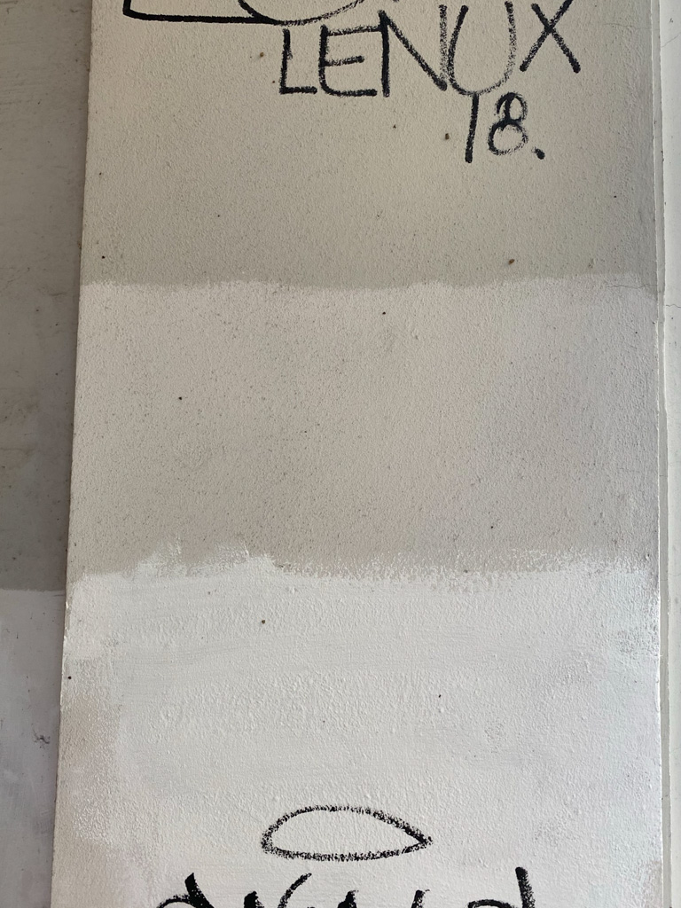
So many of the same, but different colours… Colour tones.
I’m not a painter or any type of artist or graphic professional who pays attention to the colour details or knows colour theory. I know some basic stuff for day-to-day life; white pants are a challenging choice – brave style, hell, to keep clean, dressing all in black is very not cool to some and very stylish to others (funerals excluded), guys don’t buy pink cars, if someone’s face turns blue – better get a doctor on the case asap.
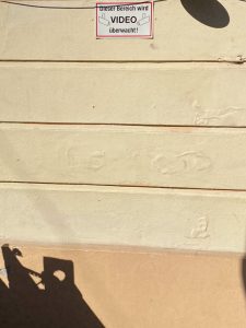
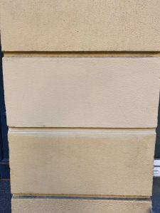
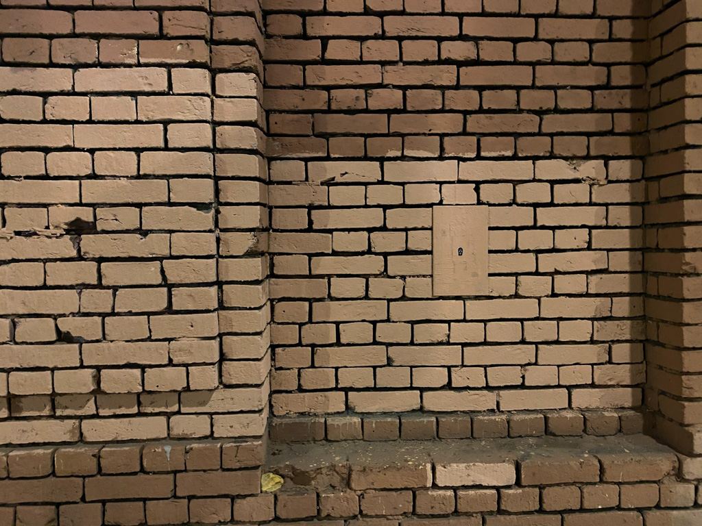
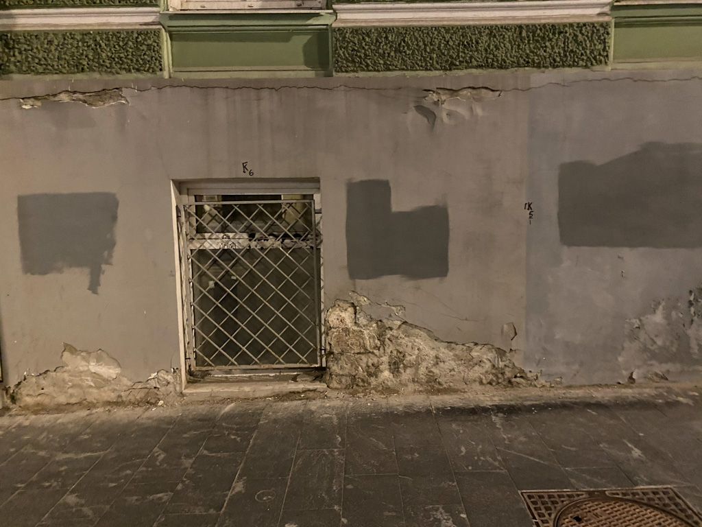
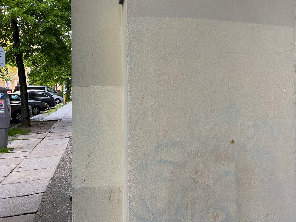
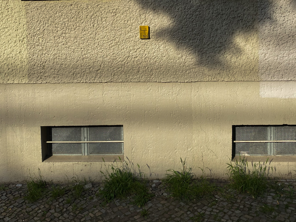
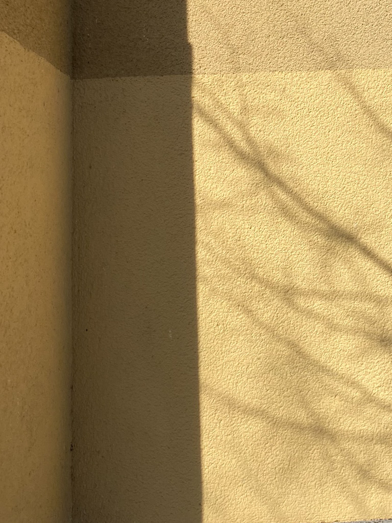
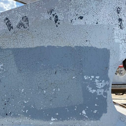
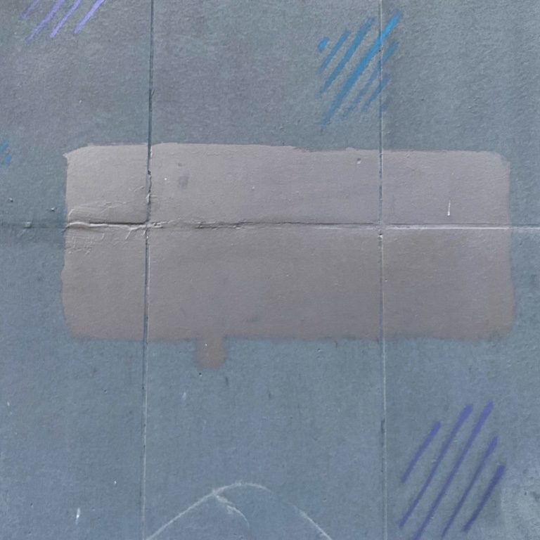
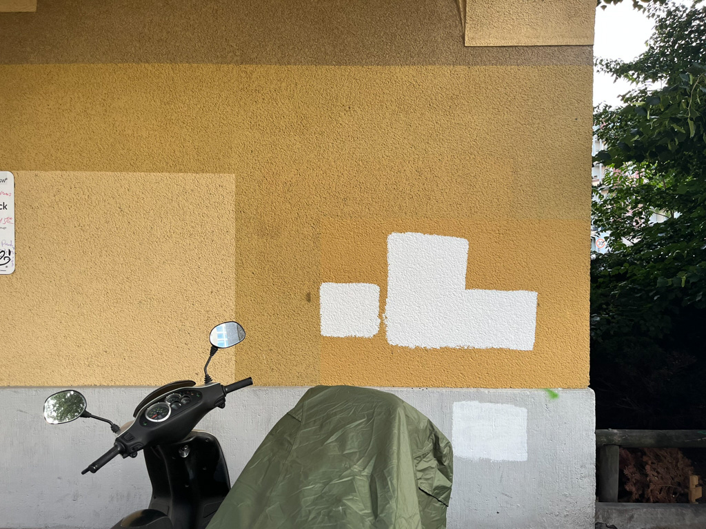
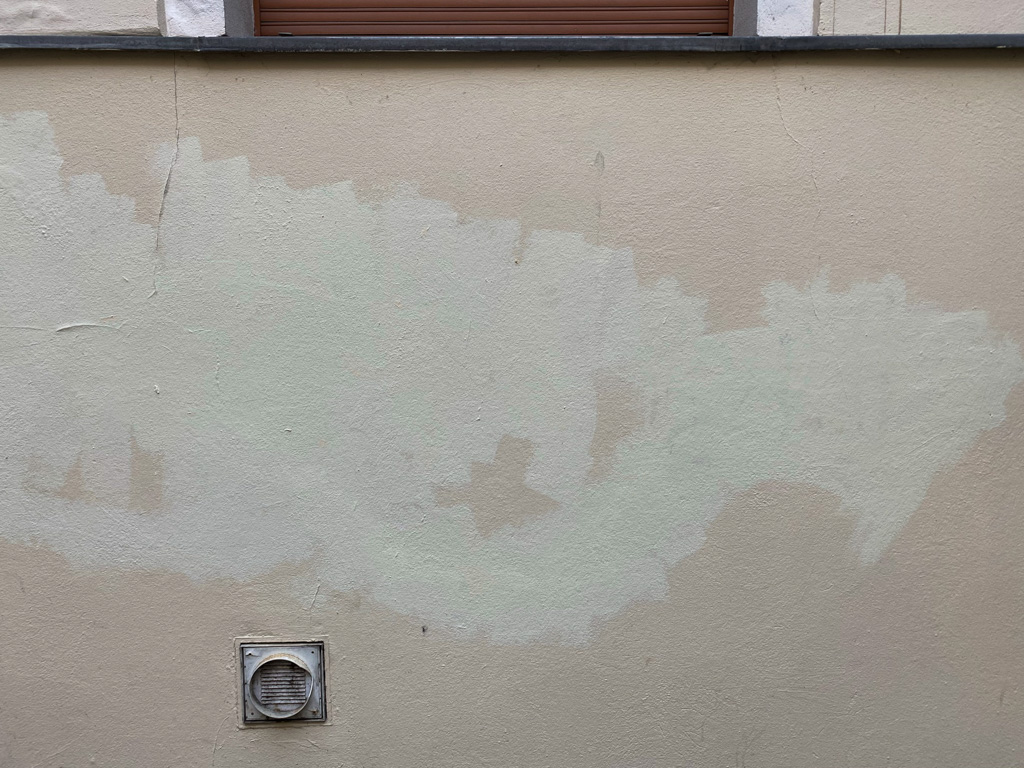
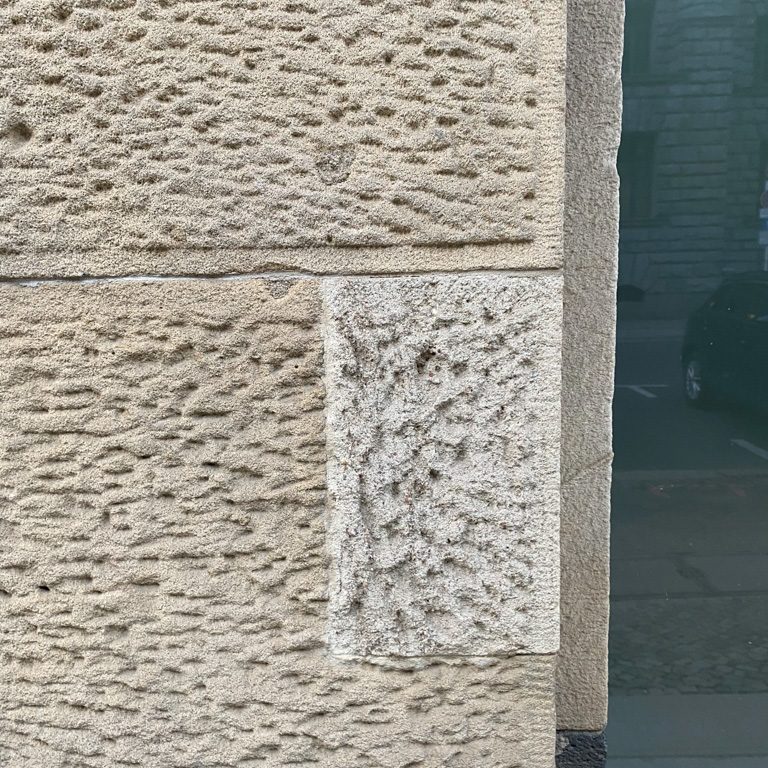
And living my whole life in different big cities – I also absorbed the “city pallets”. From century-old red bricks, to boring grey concrete, to strange soft tones, to bold attempts to stand out.
And when you live in the cities for so long, you also notice that keeping up the colour of any structure seems to be a tough task for the city services.
Well, I get it. Even without any deeper research, the reasons can be relatively obvious.
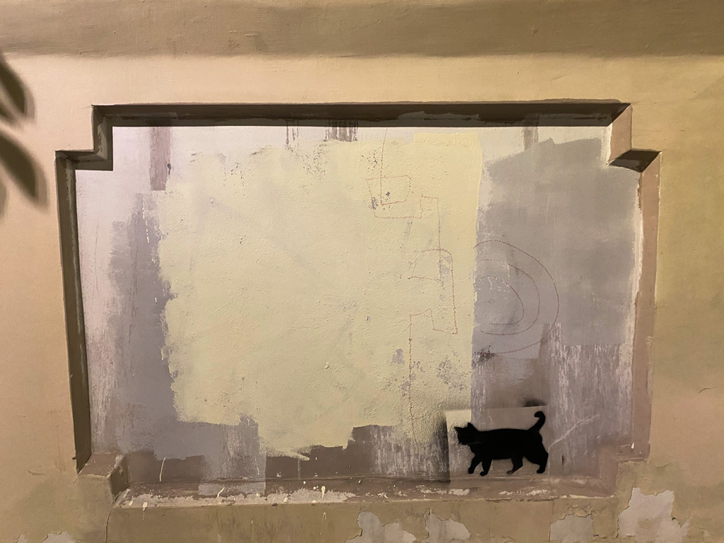
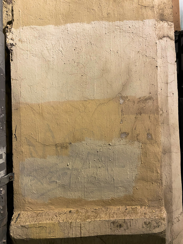
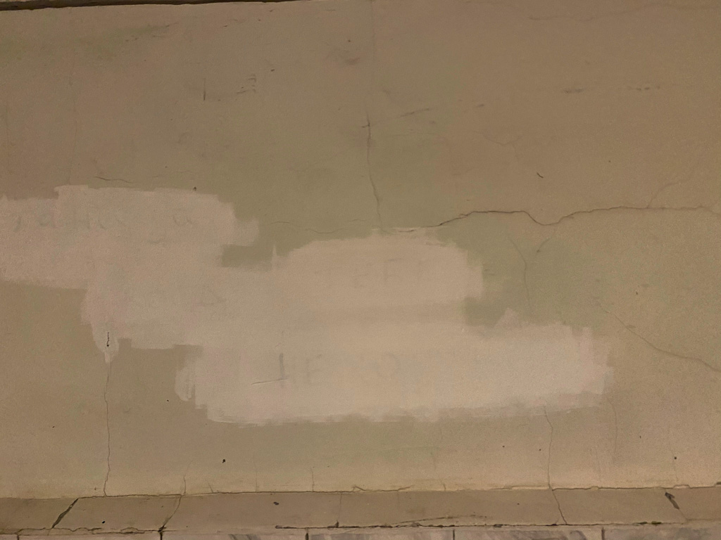
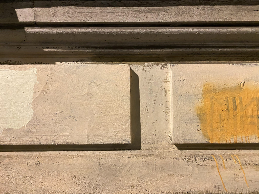
- Lost original paint (even its formula or ID) and grabbed something “similar.”
- Weather elements make the original colour fade/change, hence even the same paint looks different.
- Dirt on the original layer (not everyone washes the whole wall before painting it over…)
- Can’t be bothered…
And doing a bit of research, the list continues:
- The way you apply the paint can influence the final colour
- Regulatory changes might start dictating what is light-blue in 2010 vs light-blue in 2020 (never trust your eyes, trust the stamped and signed paper!)
- Metamerism
- Intentional temporary fix due to the plans for a full repaint in the near future
Well, the temporary fix falls under one of my most favourite sayings:
There is nothing more permanent than temporary.
But if you walk the streets of any city and pay attention to this, you’ll notice this case a lot.
I kept thinking about how to avoid it, how to fix it.
And some fixes are obvious (not all are simple, though):
- Colour-matching
- On site, in a different light, a couple of measurements, a couple of tests – can get you the right formula.
- Gradient edges / blend it in
- Stop with hard edges. Just blend it in. However, there are such massive colour mismatches that it will just look like a massive stain. But in cases with “we are pretty close,” – might work out well.
- Reduce the pallet, keep stock, keep a track, and a knowledge base on how paint fades and which tone to use after 1 year, 5, 10 …
I’m sure the list can go on with much smarter and better solutions. But, there is one solution that rules them all:
Just don’t care!
Cities are… busy. Vibrant. Moving. Changing. Things get built, things break. A patchwork of paint is probably not as critical an issue. Some cities still try, some have given up. Doing all those solutions and more equals time, money, patience, and commitment.
And after all, I was not going to try and solve it here. I was only going to share a small set of photos I took from 100s of patches that I’ve noticed through the years. These are just fun artifacts we get to live among.